
This document is designed to provide a clear framework for teams, designers, and stakeholders to understand how the brand works and how it should be applied across different contexts.
This manual defines the visual and strategic standards for BrandFrame. It ensures that every touchpoint remains consistent, professional, and aligned with our core identity as we scale
Core Pillars
Mission
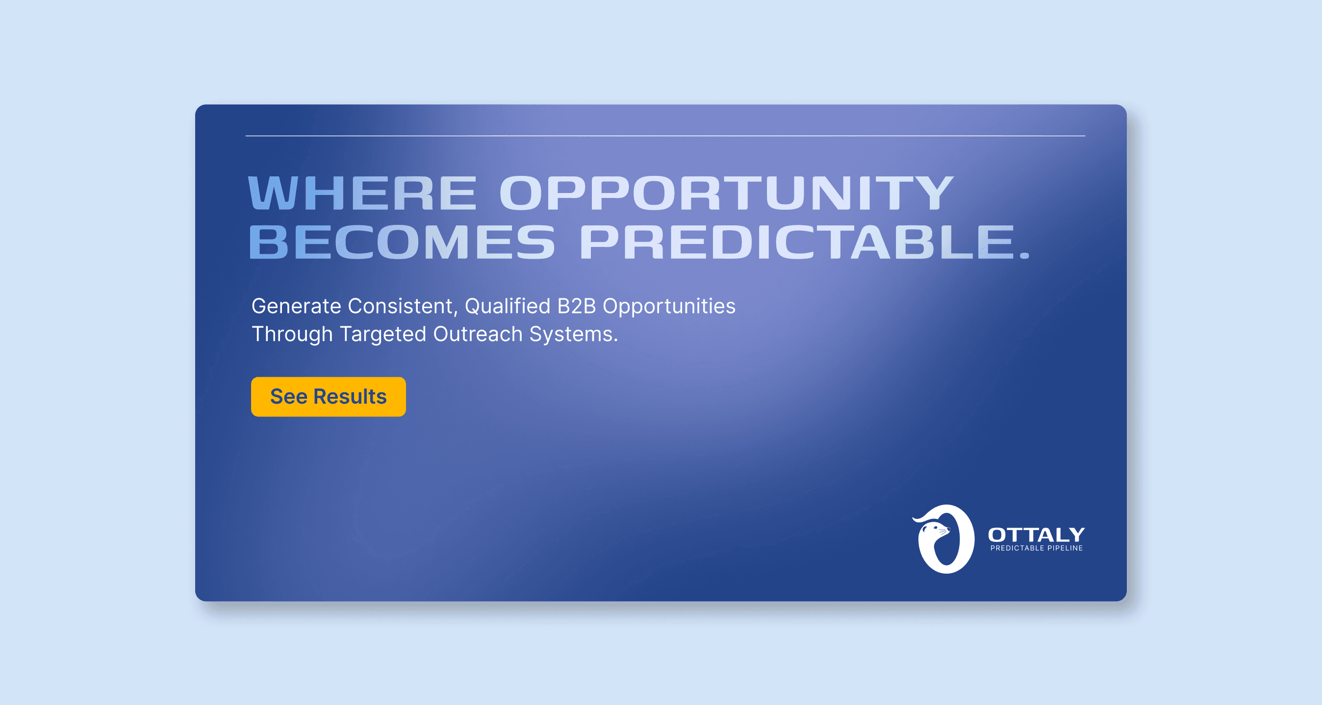
Our mission is to deliver consistently qualified B2B leads through a transparent, hands-on approach that prioritises real sales outcomes over vanity metrics.
Vision
Our vision is to become the most trusted premium lead generation partner for UK B2B companies seeking predictable, scalable growth.
Values
We value reliability, quality over volume, and honest partnerships that help our clients build predictable growth.
Brand Personality
Most lead gen agencies create complexity and noise. Otally positions itself as the clear path to a predictable pipeline.
Competitors optimise for volume. Otally optimises for qualified, sales-ready leads.
The brand signals a high-value partner, not a cheap lead marketplace.
Scarcity increases perceived value. Otally intentionally works with limited clients to maintain results.
Founder-led campaigns and manual lead vetting signal care, expertise, and accountability.
The brand communicates with confidence rather than exaggerated promises.
Target Audience
Ottaly works with UK-based B2B companies that sell products or services other businesses regularly need, and who want a predictable stream of qualified leads without building an internal sales development team. These are typically growth-focused companies, led by decision-makers like Sales Directors, Managing Directors, or CEOs looking for a reliable pipeline partner rather than a cheap lead provider.
Tone of Voice
Ottaly communicates with calm confidence, clarity, and honesty. The tone is professional and direct, never salesy or exaggerated, focusing on clear explanations, realistic expectations, and transparent communication. It should feel human, knowledgeable, and trustworthy, reflecting a boutique partner who values long-term relationships over hype or aggressive selling.
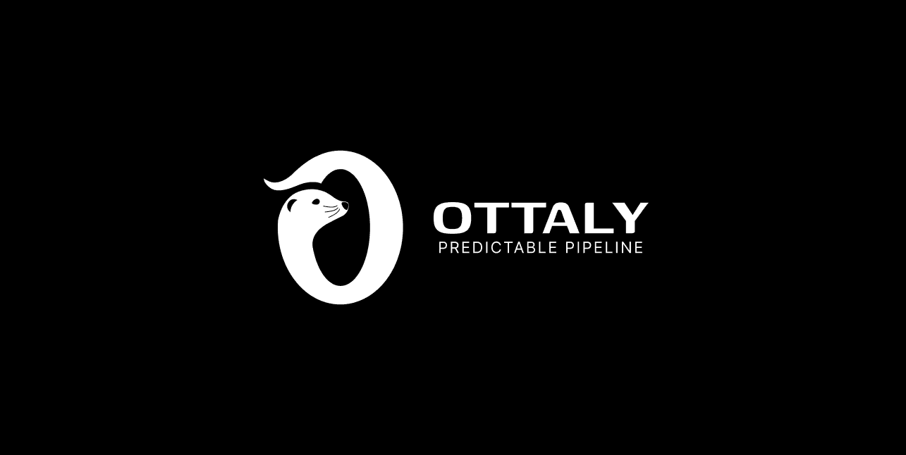
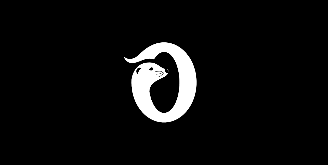
The logo symbol combines a circle and directional mark to represent a continuous pipeline of opportunity moving forward. The circle symbolises consistency, reliability, and a system that keeps generating results, while the forward point represents qualified opportunities being delivered with precision, reinforcing Ottaly’s focus on predictable, high-quality lead generation rather than random volume. An added unique element of an otter creates recognition for the brand and character.
Our Logo
Primary Logo
The primary logo is the main visual identifier of the brand. It combines the wordmark and symbol into a single, balanced unit and should be used in most brand applications.
This version is recommended whenever space and contrast allow for optimal legibility.
Secondary Logo
The secondary logo is an alternative version designed for layouts where the primary logo does not fit naturally.It should be used selectively and only when the primary logo cannot be applied without compromising clarity or composition.

Icon
The icon is a simplified representation of the brand and should be used in contexts where space is limited or where a minimal brand presence is required. Common use cases include: Favicons, App icons, Social media avatars, Small UI elements.The icon should never replace the primary logo in formal or prominent brand applications.
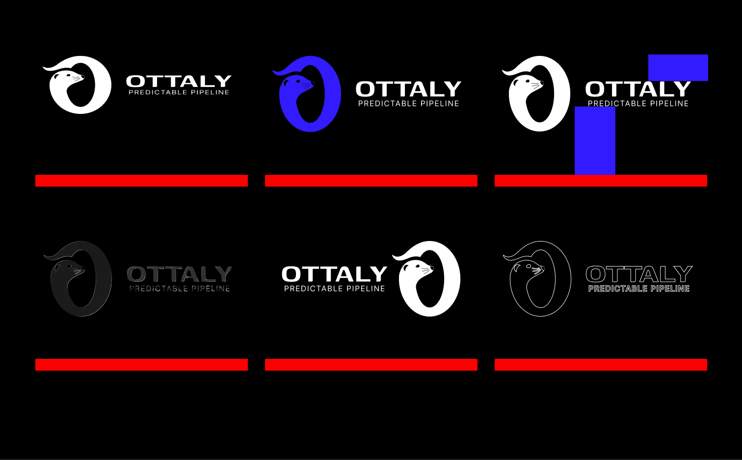
Rules
Clear Space
To ensure brand integrity and visual impact, a mandatory protection area has been defined that must remain free of outside elements. The "X" unit of measurement is extracted directly from the height of the symbol's lower module (letter B), providing a consistent internal metric that dictates the required clear space on all four sides of the asset.

To preserve legibility and visual system recognition, the logo must not be reproduced at sizes smaller than those specified. These limits ensure that the symbol's anatomical details, such as the central division of the letter B, remain sharp in both digital and print media.

The integrity of the visual identity depends on the consistent application of its rules. It is strictly forbidden to alter, distort, or modify the logo components. Respecting the "X" unit of measurement and the original structure is fundamental to maintaining the brand's visual authority.
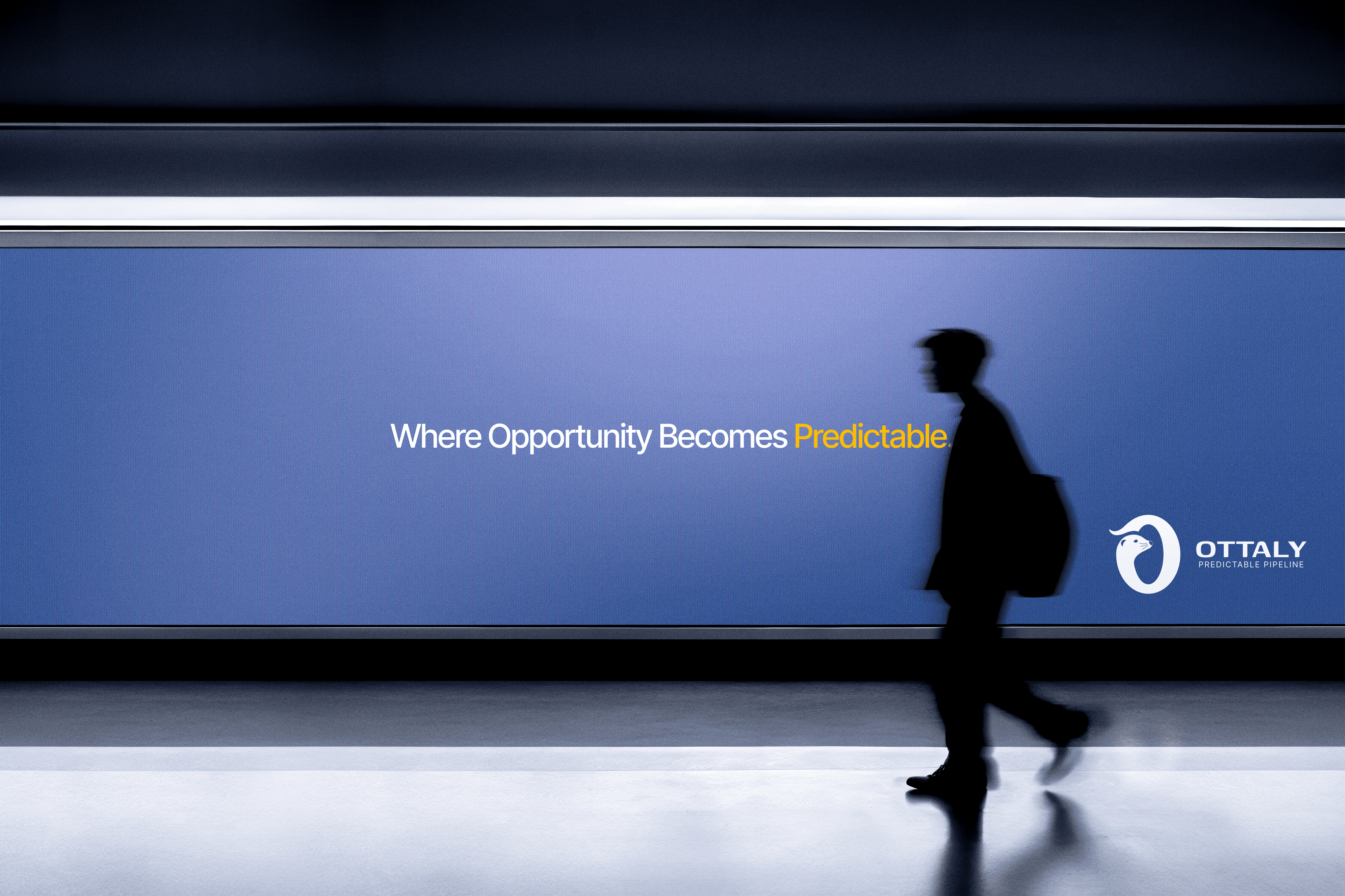
The deep blue gradient signals trust, stability, and authority, which are essential in B2B decisions. The lighter tones introduce clarity and forward momentum, reflecting Ottaly’s promise of predictable growth.
The yellow accent is used sparingly to add energy and draw attention, highlighting key moments of opportunity without disrupting the calm, trustworthy foundation of the brand.
Neutral Colors
Background
Used in a progression from dark to light (BG-Primary to BG-Quaternary) to establish layout depth. Apply deeper tones for base foundations and lighter variants to create subtle relief and contrast between structural containers.
Text
Organized in a descending scale from pure white to dark blue (Text-Primary to Text-Quaternary) to define information priority. Use primary tones for high-impact headlines and secondary variants for body copy and metadata to ensure optimal legibility. Usability depends also on high contrast against background.
Copy HEX
HEX:
FFFFFF
RGB:
255, 255, 255
Copy HEX
HEX:
D2E4F8
RGB:
210, 228, 248
Copy HEX
HEX:
7C89CD
RGB:
124, 137, 205
Copy HEX
HEX:
224388
RGB:
34, 67, 136
Copy HEX
HEX:
050C29
RGB:
5, 12, 41
Copy HEX
HEX:
E5E5E5
RGB:
229, 229, 229
Copy HEX
HEX:
FFFFFF
RGB:
255, 255, 255
Accent Color
The accent color is strategically implemented to highlight key elements and guide user attention across the interface. It is specifically recommended for active states, highlights, key indicators, and interactive elements. To preserve its visual impact and maintain a clean hierarchy, this color should be used sparingly throughout the design system.
Copy HEX
HEX:
1F6F78
RGB:
28, 122, 154
Copy HEX
HEX:
FFB700
RGB:
225, 183, 0
Usage Guidelines
Prioritize neutral colors in most layouts.
Use the accent color only where emphasis is required.
Avoid using accent colors as primary backgrounds.
Maintain a consistent color application across all brand touchpoints and digital platforms
Inter was chosen for its clarity, neutrality, and precision.
Primary Font
Inter
2018
4 Styles
Genos is a modern, condensed sans-serif that brings a sense of precision, structure, and confidence to the brand. Its tall, refined proportions create strong visual impact while maintaining clarity, making it ideal for headlines and key messaging. The typeface communicates control, focus, and efficiency—aligning with Ottaly’s positioning as a strategic growth partner delivering predictable outcomes. Its clean geometry reinforces a sense of reliability and order, helping the brand feel both professional and distinctly premium.
Fit
width
40 px
33 px
28 px
23 px
19 px
16 px
13 px
The typographic system follows a Minor Third (1.2) scale for secondary hierarchy (H2–H6) and body text, creating consistent and harmonious spacing across the interface. Headings scale progressively to maintain clear visual hierarchy without overwhelming the layout.
As a strategic exception, H1 is designed with fluid scaling relative to viewport width to maximise impact and presence. For web environments, it is constrained to a maximum width of 900px to ensure optimal readability and line length. In print and brand applications, H1 scales proportionally without fixed constraints, allowing for greater flexibility and visual expression.
Secondary Font
Inter
2018
4 Styles
Inter is a highly legible sans-serif designed specifically for digital environments, making it ideal for body copy and supporting text. It communicates clarity, transparency, and ease of use—qualities that reflect Ottaly’s straightforward, no-friction approach to working with clients. Its balanced proportions and neutral tone ensure information is easy to read and digest, reinforcing trust while supporting a structured and professional user experience across all digital touchpoints.
Fit
width
40 px
33 px
28 px
23 px
19 px
16 px
13 px
The typographic system follows a Minor Third (1.2) scale for secondary hierarchy (H2–H6) and body text, creating consistent and harmonious spacing across the interface. Headings scale progressively to maintain clear visual hierarchy without overwhelming the layout.
As a strategic exception, H1 is designed with fluid scaling relative to viewport width to maximise impact and presence. For web environments, it is constrained to a maximum width of 900px to ensure optimal readability and line length. In print and brand applications, H1 scales proportionally without fixed constraints, allowing for greater flexibility and visual expression.
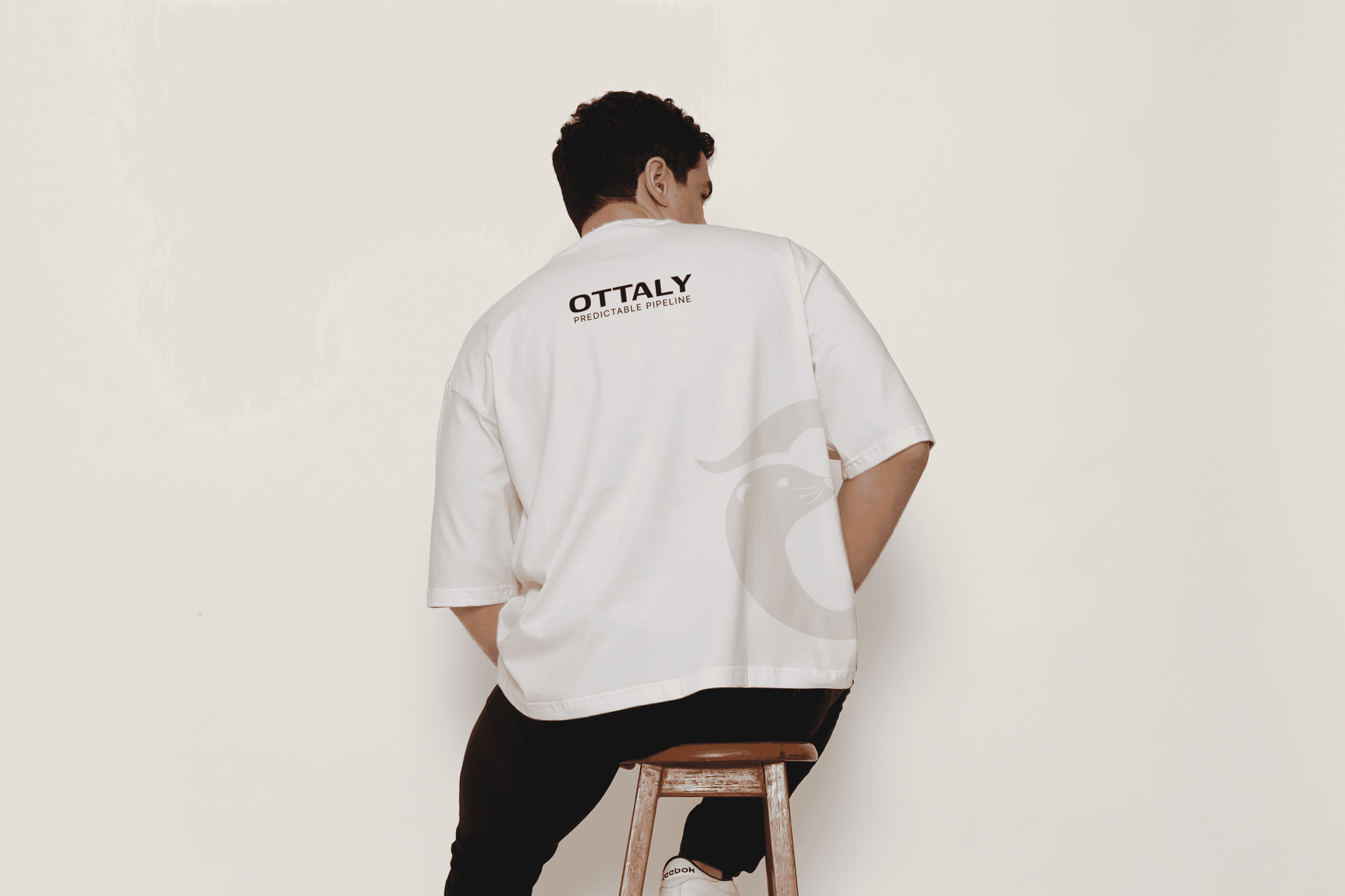
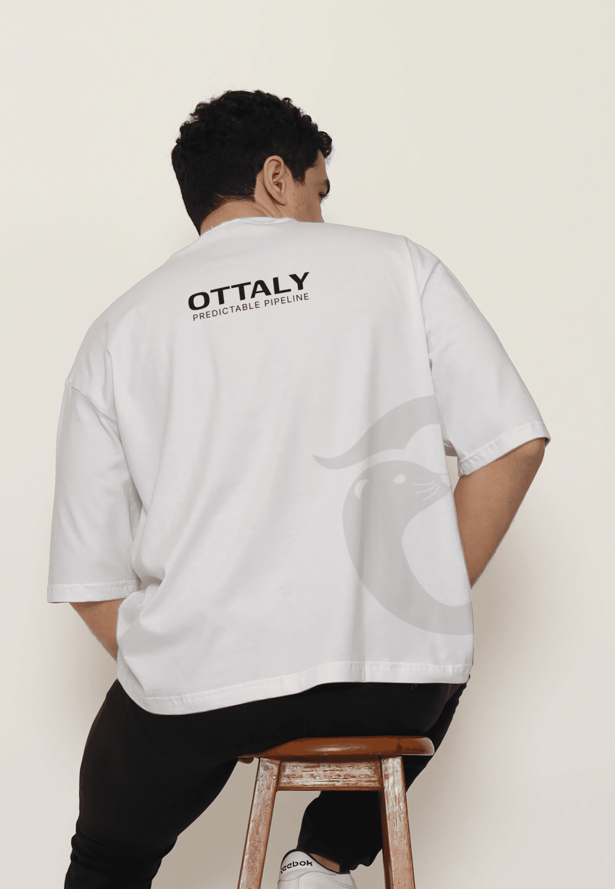
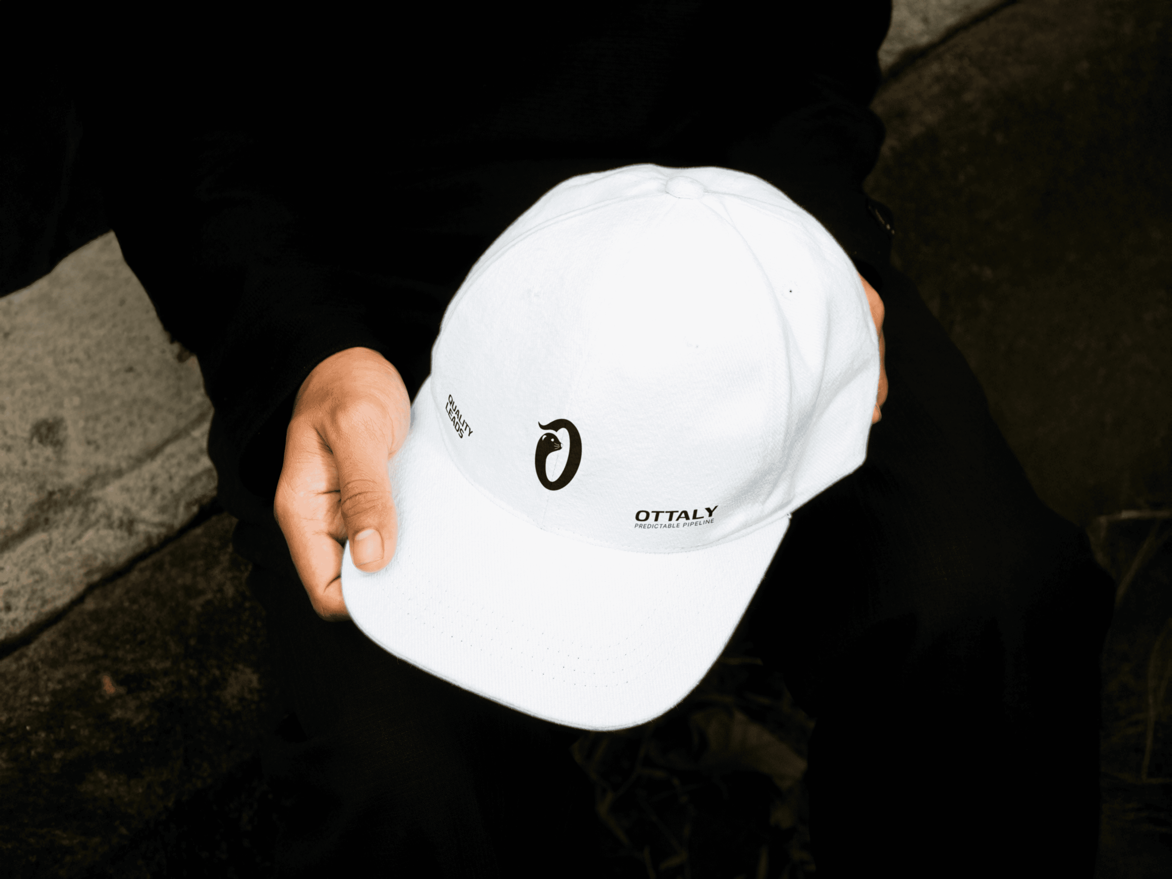
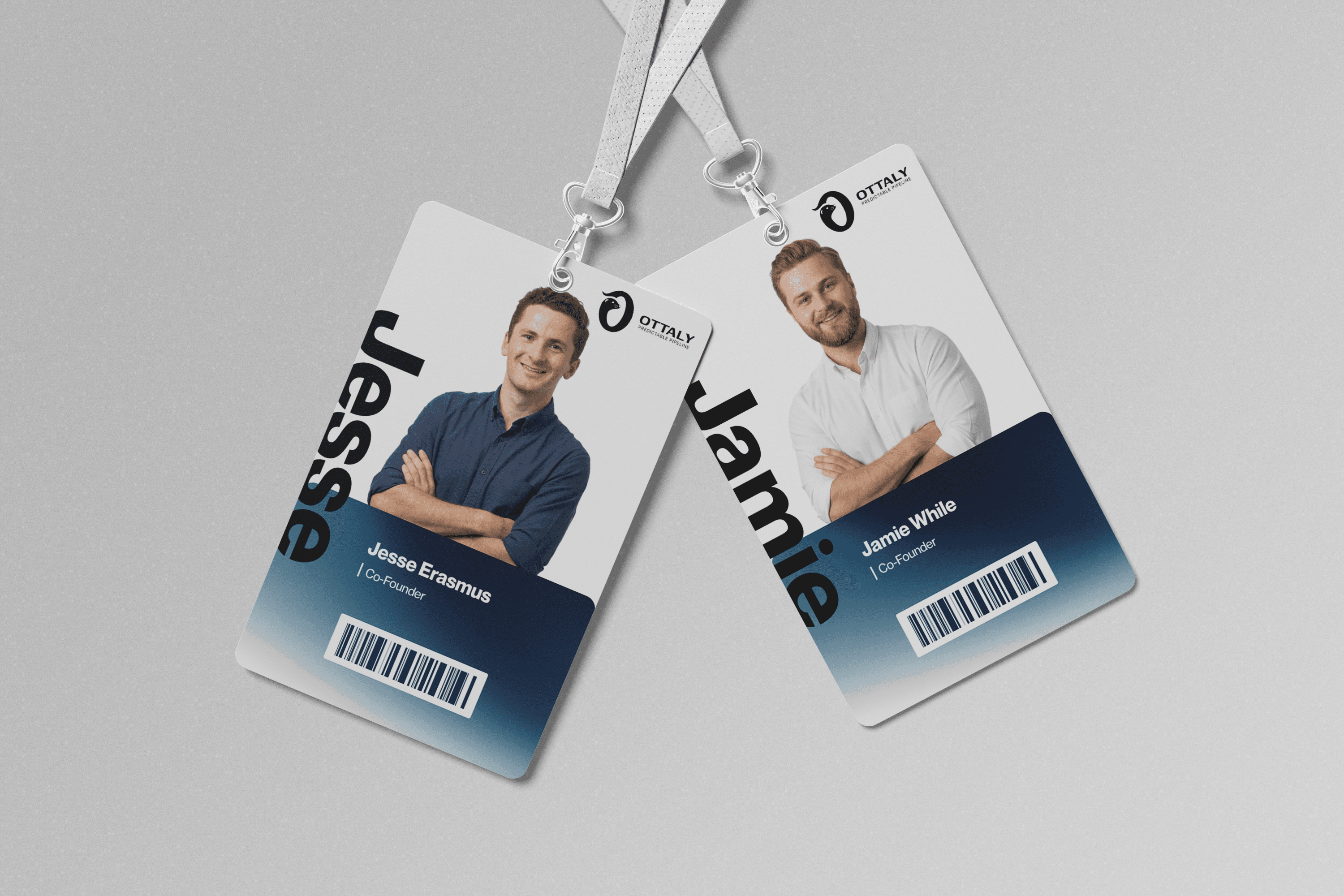
This gallery demonstrates the adaptability of our rigid structural rules across diverse formats, from digital interfaces to physical environments, ensuring a consistent architectural presence.


The complete toolbox for BrandFrame. This section provides access to all core design files, typography, and visual assets required to maintain the system's integrity across any medium.

Logotypes
Images and Scalable vector files for primary and secondary brand marks, optimized for web and print.
Imagery
High-resolution technical photography selection used across the BrandFrame framework. Optimized for web performance.